AI House Color Visualizer: Test Exterior Color Palettes From a Photo
Last updated March 2026
An AI house color visualizer is useful when the real decision is bigger than “which paint chip looks nice?” Exterior color covers large surfaces, changes with daylight, and has to work with fixed materials such as roof shingles, brick, stone, concrete, windows, gutters, landscaping, and neighboring homes. A color that looks calm on a small sample can feel too blue, too yellow, too dark, or too flat once it is spread across the whole facade.
For homeowners, the risk is regret. Painting a house is public, expensive, and hard to reverse quickly. For painters, the risk is misalignment: a client approves a color name or tiny swatch, then reacts differently when the full elevation is finished. A photo-based color preview gives both sides a clearer conversation before gallons are ordered, crews are scheduled, or HOA approval is requested.
RedesAIgn can help with that early visual step. Upload a clear exterior photo, choose the Exterior Editor, and generate controlled color directions that keep the home recognizable. If you want to compare exterior palettes on your own house photo, start free with RedesAIgn with 5 free AI credits and no credit card required.
What an AI house color visualizer should actually decide
The best house color preview does not try to redesign everything at once. It should answer a specific color question: which body color, trim contrast, front door tone, garage color, shutter color, or accent palette makes this home look more intentional while respecting the materials that are staying?
For painters, the useful output is a decision aid. Instead of discussing vague words like “warm neutral,” “modern gray,” “coastal white,” or “earthy green,” the client can compare visible options on their own facade. A painter can use the image to ask better questions: should the trim stay bright, should the garage door recede, should the front door become the accent, and does the selected palette work with the roof and masonry?
For homeowners, the useful output is a shortlist. The visualizer should help narrow twenty possible color ideas down to two or three color families worth sampling. It can also reveal when a dramatic palette is doing too much, when a safer refresh is enough, or when fixed materials are forcing the project toward warmer or cooler undertones.
The concrete next step might be “sample these two greige body colors,” “quote a body-and-trim repaint only,” “keep the brick unpainted,” “test a darker garage door,” or “send the restrained version to the HOA.” If the image does not make the next step clearer, it is decoration rather than decision support.
Compare color and finish before buying samples
Exterior color is a relationship between surfaces. Body color may be the largest field, but trim, fascia, gutters, shutters, doors, garage doors, porch columns, foundation color, and railings all affect the final read. A good AI house color visualizer workflow compares complete palettes, not isolated colors floating outside the home.
Start by looking at undertone. Warm whites, creams, taupes, tans, clay colors, olive greens, and brown-based neutrals often sit naturally with warm brick, tan stone, bronze windows, and brown roofs. Cooler whites, blue-grays, charcoal, slate, navy, and black accents often work better with gray roofs, white windows, concrete, and cooler masonry. Mixed-material homes need special care because one surface may push warm while another pushes cool.
Then compare contrast. High-contrast trim can make windows, gables, and porch details feel crisp, but it can also make a busy facade busier. Low-contrast trim can feel calm and expensive, but it may flatten a house that needs definition. Dark body colors can look refined in a generated image, yet they may feel heavy on a low ranch, fade faster in harsh exposure, or require product guidance from the painter.
Finish matters too. Most AI previews will not reliably communicate exact sheen, substrate condition, or manufacturer formula. Treat the image as a direction finder. Use it to decide which color families deserve real sample boards, then view those samples on the actual house in morning, midday, and evening light.
Generate a safe option and a bold option
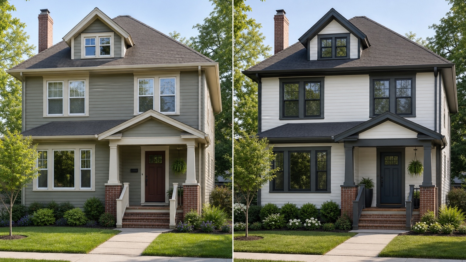
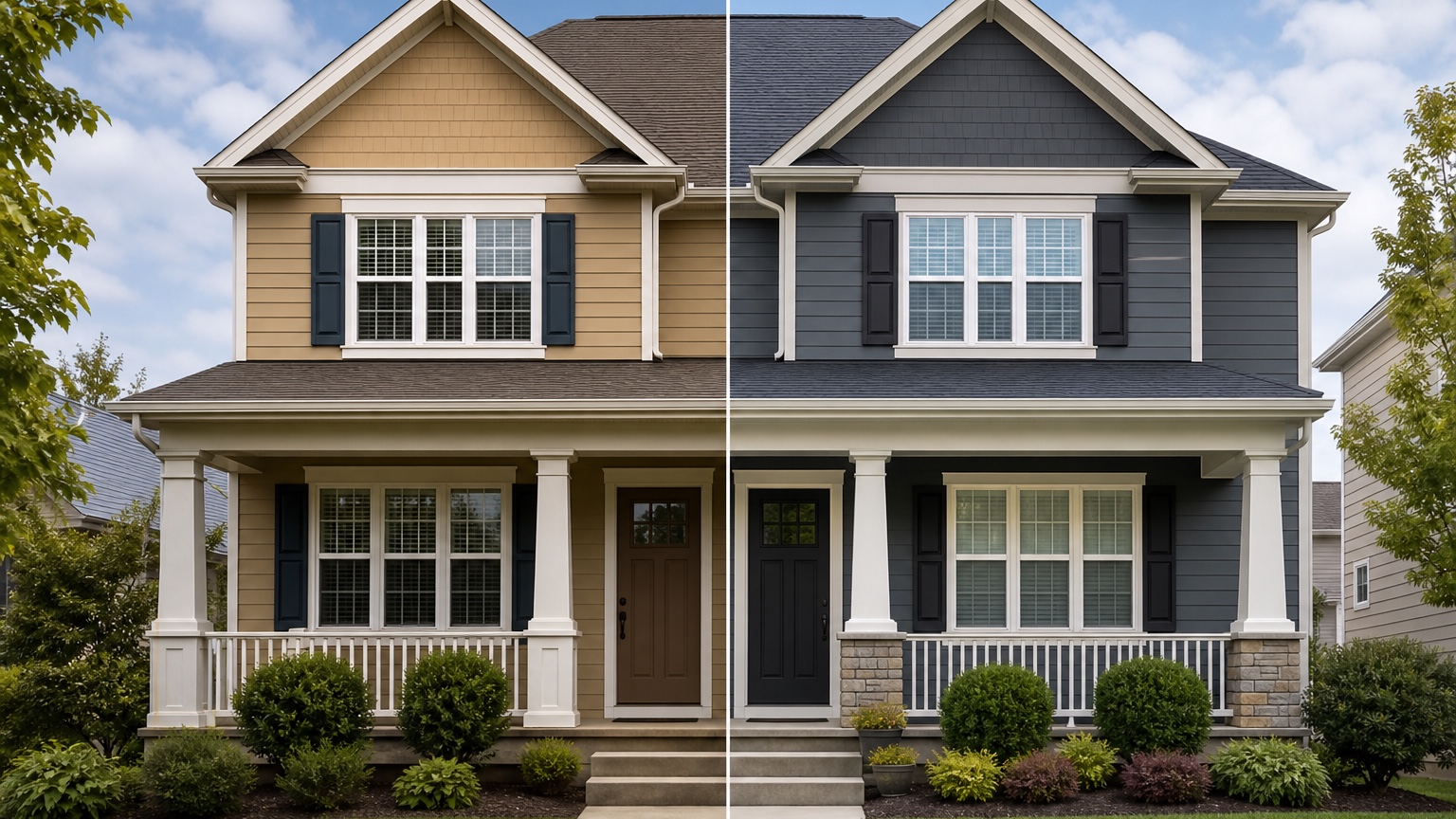
A practical color comparison should include at least three versions: safe, practical upgrade, and bold. The safe version stays close to the existing home but cleans up the palette. It might keep a similar body color, improve trim contrast, repaint the front door, and make the garage less dominant. This option is useful because it shows whether the home needs a full color rethink or simply a more polished version of what already works.
The practical-upgrade version changes the main color family while staying believable for the architecture and neighborhood. Examples include warm white with soft charcoal trim, muted sage with cream trim, greige with a stained-wood-look door, or a darker neutral with lighter fascia. This is often where the best homeowner decision lives: noticeable improvement without making the house feel disconnected from its roof, masonry, landscape, or street.
The bold version is where you test risk deliberately. Dark siding, black trim, navy doors, deep green body color, or high-contrast modern palettes can be excellent on the right house and wrong on another. Seeing the bold version on the actual photo helps homeowners and painters identify whether the idea is worth sampling or whether it only looked good in inspiration images.
Keep each version controlled. If the safe option changes only paint but the bold option also adds new windows, new stone, new lighting, and perfect landscaping, the comparison is unfair. The decision is house color, so the house should remain the same house.
Start with a photo that shows color honestly
A believable house color preview starts with a strong source photo. Use a front elevation or three-quarter view that shows the full facade: siding or stucco, trim, eaves, gutters, front door, garage door, shutters, roof, masonry, porch, driveway, and foundation planting. If one side of the house has important siding or a visible garage wing, capture that angle too.
The camera should be level and far enough back to avoid distorting the house. Extreme wide-angle phone photos can stretch rooflines and make garage doors or porches seem larger than they are. If the photo crops off the roof, hides the entry behind a car, or places half the facade in deep shadow, the AI may make confident-looking but unreliable color decisions.
Soft daylight is usually best. Overcast conditions often show surfaces and edges more evenly than harsh noon sun. Early morning or late afternoon can be beautiful, but warm light may make whites, creams, and tans look more golden than they would at other times. For important projects, generate concepts from more than one photo so the chosen palette is not based on a single lighting condition.
Remove avoidable distractions before uploading. Cars, trash bins, holiday decor, temporary signs, open garage doors, and heavy plant shadows can interfere with edges and color fields. You do not need a professional photo, but you do need a clear image of the exterior the painter or homeowner is actually evaluating.
For broader facade planning beyond color, the workflow overlaps with AI exterior design from photo. For paint-specific decisions, keep the source photo focused on color readability and fixed material relationships.
Prompt brief for stronger house color results
A strong prompt starts with the outcome: a realistic curb-appeal color plan for this specific home. It should name the surfaces to change, the features to preserve, and the constraints that matter.
Try a homeowner version like this:
“Create a realistic exterior house color preview for this home. Preserve the roofline, windows, brick, stone, siding profile, porch footprint, driveway, and landscaping structure. Test a warm greige body color, soft white trim, a deeper taupe garage door, and a muted olive front door. Keep the result believable for a real repaint project.”
For a painter preparing client options, try:
“Show three controlled exterior color palettes on the same house photo: one safe neutral refresh, one warmer practical upgrade, and one bolder high-contrast option. Do not change the roof, windows, masonry, siding layout, porch, driveway, or landscape design. Focus only on body color, trim, shutters, front door, garage door, fascia, and gutters.”
If HOA rules, historic district guidance, product limitations, heat exposure, resale concerns, or budget matters, include those constraints. If the brick will remain natural, say so. If the garage door is being painted but not replaced, say so. If the quote only covers trim and body color, do not ask for new siding, windows, stone, and landscape at the same time.
Reference images can help when they clarify a palette, but they should not override the real home. A black-and-white farmhouse reference may not translate to a red-brick colonial. A coastal white palette may fight a warm brown roof. Use references as mood guidance, then let the actual exterior photo remain the anchor.
Review the output before anyone trusts the image
AI color previews can look polished while still making small mistakes that matter. Check edges first. Body color should follow siding, stucco, shakes, or panels. Trim color should stay on trim. Door color should not bleed into glass, hardware, steps, or landscaping. If the AI paints brick that was meant to remain natural, changes the garage door style, or invents shutters, revise the prompt.
Check lighting next. The new colors should respond to the original sun direction and shadows. If the shaded side of the house becomes unnaturally bright or a dark color loses all texture, treat the image as mood direction rather than a reliable review. Exterior color always shifts in real light, so the preview should help you ask better sample questions, not replace sampling.
Then compare the concept against practical constraints. HOA rules may restrict body color, trim contrast, door colors, or painted masonry. Older homes may need lead-safe practices. Weather exposure, substrate condition, peeling paint, moisture, caulk failure, wood rot, and surface prep all affect cost and feasibility. An AI image cannot inspect those conditions or produce a final quote.
Save the strongest version as a facade before-and-after and palette note. Include what changed, what stayed unchanged, which direction looked best, which alternatives were rejected, and what still needs physical samples or professional review. That makes the image useful for a spouse, client, painter, HOA board, realtor, or project file.
Common mistakes that make house color previews generic
The first mistake is asking for a full makeover when the real decision is color. “Make my house modern with new windows, new roof, stone entry, landscaping, and black paint” may produce an exciting image, but it will not isolate the color decision. Keep color testing separate from larger exterior remodeling.
The second mistake is ignoring fixed materials. Roof color, brick, stone, concrete, window frames, gutters, and existing landscape tones can make a palette succeed or fail. If those elements are staying, the prompt should preserve them and the review should judge the color against them.
The third mistake is skipping the boring option. Safe palettes are not wasted generations. They create a baseline and often reveal that a modest trim adjustment, warmer body color, or better front door accent solves the problem without a risky repaint.
The fourth mistake is treating the generated image as an exact paint formula. Screens vary, AI colors vary, and paint changes by sheen, substrate, product line, and daylight. Use the preview to narrow direction, then confirm with real paint samples and a painter’s guidance.
How to use RedesAIgn for house color planning
In RedesAIgn, upload the clearest exterior photo and choose the Exterior Editor. Start with a restrained prompt that preserves architecture and changes only paintable color surfaces. Generate a safe refresh first, then revise or remix the prompt for warmer, cooler, lighter, darker, and higher-contrast palette directions.
Use saved prompts and history to keep track of what worked. If one result has the right body color but changes the roof or windows, revise the prompt and restate what must stay unchanged. If a reference image captures the trim contrast or door tone you like, use it to clarify mood rather than replacing the original house style.
If the decision expands beyond paint into siding, roofing, windows, or broader curb appeal, compare this workflow with AI exterior paint visualizer, AI siding visualizer, and AI roof color visualizer. Separating those decisions keeps quotes, samples, and approvals cleaner.
When you are ready to test exterior palettes on your own photo, try RedesAIgn for free with 5 free AI credits and no credit card required. After that first round, you can buy one-time credit packs only when you want to keep exploring more color directions.
FAQ: AI house color visualizer
What is an AI house color visualizer?
An AI house color visualizer uses a photo of a real home to preview exterior color palettes for paintable surfaces such as siding, stucco, trim, fascia, shutters, front doors, and garage doors.
Can it choose the exact paint color for me?
No. It can help narrow color families and compare palettes visually, but final paint choices should be confirmed with physical samples on the house in real daylight.
Is this useful for professional painters?
Yes. Painters can use AI previews as client discussion references, approval aids, and quote context, as long as everyone understands that surface condition, product selection, prep, and final color matching still need professional review.
How many color palettes should I test?
Start with three: a safe refresh, a practical upgrade, and a bold option. Then refine the strongest direction with smaller changes to trim, garage, shutters, or front door color.
What should my prompt include?
Include the desired color direction, the surfaces to change, the fixed materials to preserve, and constraints such as HOA rules, roof color, masonry, weather exposure, project scope, and whether the goal is homeowner planning or painter approval.