AI Wall Color Visualizer for Interior Rooms
An AI wall color visualizer interior workflow turns a real room photo into a practical light and undertone decision lab. Paint is one of the least expensive interior changes, but it is also one of the easiest to misjudge. A color that looks clean on a screen can turn blue beside warm oak floors. A beige that seems safe on a fan deck can look pink against white trim. A dramatic green may be beautiful in a saved inspiration image and still feel too dark in the room where you read, cook, work, or welcome clients.
For painters and homeowners, the value is not pretending that an image can replace physical paint samples. It cannot. The value is narrowing the field before buying quarts, taping sample patches across every wall, or asking a painter to quote a color direction that is still vague. With a real photo, you can compare warm white, mushroom, muted blue, soft clay, charcoal, or a bolder accent wall in the same room conditions.
RedesAIgn supports that early comparison stage with 10 AI editors, prompts, remix, reference images, saved prompts, and history. You can start with 5 free AI credits with no credit card required, then continue with one-time credit packs if more rounds are worth it. Because paint is often a commercial-use decision for stagers, landlords, painters, and small design teams, the ability to test and present options before a paid job can save time without committing to a subscription.
Treat the room like a color lab, not a blank wall
Wall paint never appears by itself. It reflects daylight, absorbs shadows, and borrows color from everything around it. Before using an AI wall color visualizer interior tool, write down the fixed color influences in the room: trim, ceiling, flooring, doors, cabinets, fireplace stone, large rugs, sofa fabric, curtains, metal finishes, and nearby rooms visible through openings. These surfaces explain why the same paint can look calm in one home and wrong in another.
Start with the element least likely to change. If the floors are staying, the paint should respect them. Honey oak, red oak, gray LVP, dark walnut, concrete, and terracotta tile all push wall color in different directions. If the trim is staying bright white, creamy paint may look dingy. If the trim is warm off-white, a cool gray wall may make it seem yellow. If the ceiling is not being painted, include that in the prompt.
A useful first prompt is specific: “Use this room photo to preview interior wall paint options. Preserve the furniture, flooring, trim, ceiling, window placement, art, and lighting. Change only the wall color to a warm soft white with no gray cast. Keep the result realistic and keep shadows natural.” That instruction frames the image as a paint test rather than a redesign.
If you also want to change furniture, decor, or layout, separate that work from the paint round. A broader guide like AI interior design from photo is better for whole-room style exploration. For a paint decision, discipline is the point: change the walls, keep the room.
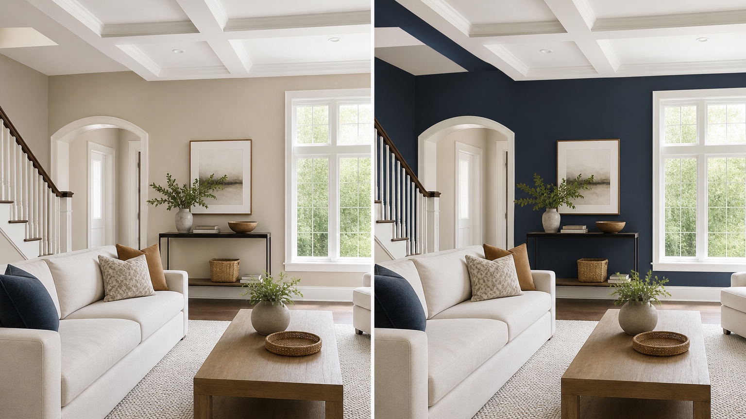
Photograph daylight and evening conditions separately
Paint is sensitive to light temperature, so one photo is rarely enough for a serious decision. Take a daylight photo when the room receives its normal natural light. Then take an evening photo with the lamps and overhead fixtures you actually use. Do not blend the two into one request. Use them as separate tests: the daylight image reveals undertone shifts; the evening image reveals whether the color becomes muddy, harsh, cold, or too saturated after sunset.
For the daylight photo, open curtains or blinds to the normal daytime position. Avoid a beam of direct sun across one wall if possible because it can exaggerate contrast. Stand far enough back to include wall planes, trim, ceiling line, floor, and any large furniture that will stay. Keep the camera level so the visualizer understands the room geometry. If one wall is the main decision, include enough surrounding material to judge it properly.
For the evening photo, turn on the lights you usually use. If the room has mixed bulbs, note it in the prompt: “Warm table lamps and cooler recessed lights are both on.” A paint that looks elegant under daylight can turn green, purple, or flat under LEDs. The visualizer cannot measure light reflectance value or spectral output, but it can help you see which direction is risky before you buy samples.
Painters can use this two-photo process with clients before a site visit or between visits. Homeowners can use it to prevent the common mistake of picking a color from a midday sample and hating it every night. Save the prompt that produces the most faithful room, then remix only the paint color across both lighting conditions.
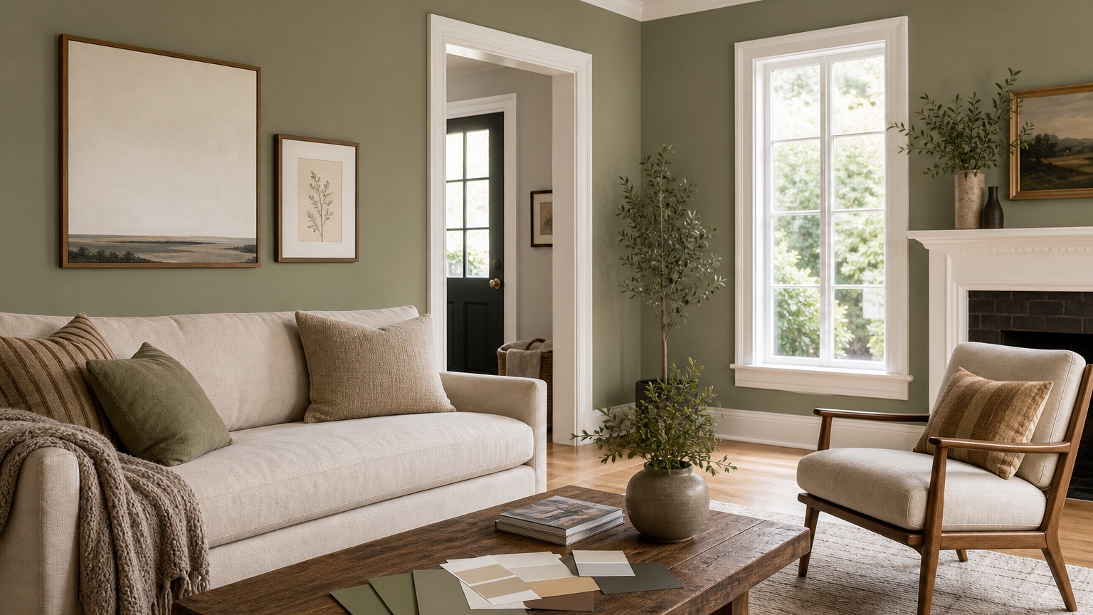
Compare safe neutrals and bold colors in controlled rounds
Most paint decisions fall into two emotional categories: “I want a safe color I will not regret” and “I want the room to feel more interesting.” Test both, but do not mix every possible palette in one pass. Start with safe candidates: warm white, clean off-white, pale greige, soft taupe, mushroom, or a quiet beige. Ask for one change at a time so the result shows the wall color instead of a full makeover.
Then create a bold round. Choose colors that make sense with the room’s fixed surfaces: muted olive, smoky blue, clay, aubergine, charcoal, cocoa, dusty teal, or a deep warm green. Specify whether all walls change or only one wall. Accent-wall prompts should name the wall: “Make only the fireplace wall a deep muted green and keep the other walls warm white.” If the output paints the wrong surface, revise the instruction rather than judging the color.
Use remix for small differences. Instead of asking for “four trendy greens,” use variations with real decision language: “a gray-green that stays muted,” “a warmer olive with brown undertone,” “a deeper forest green for the dining wall,” and “a lighter sage that does not read mint.” This helps you identify the undertone that works, not just the color name you like.
For a shared decision with a spouse, landlord, client, or painter, label each option by color behavior: “warm white, low contrast with trim,” “mushroom, softens oak floor,” “sage, adds color without darkening room,” or “charcoal accent, strongest contrast.” Those labels make the review more productive than “Option A” and “Option B.”
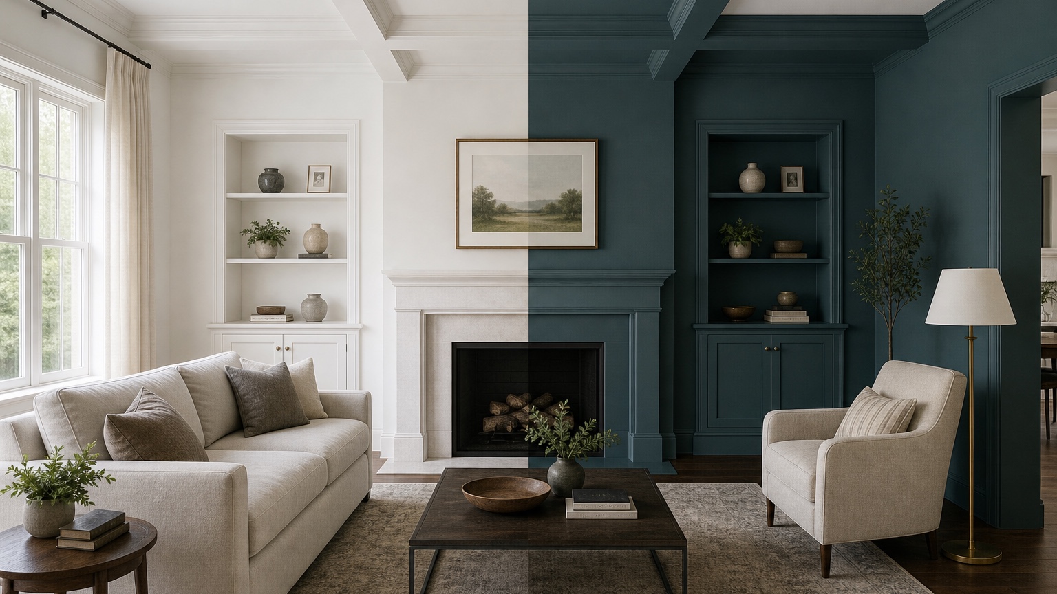
Watch trim, ceilings, and floors before choosing the winner
Trim and ceiling color decide whether a wall color feels crisp, creamy, dingy, or intentionally layered. If trim will remain, tell the prompt to preserve it. If trim can change, test that as a separate decision. Painting walls and trim the same color can look seamless in a bedroom or office, but it may hide architectural detail in a historic room. Bright white trim can sharpen a blue or green wall, but it can also make a warm neutral look dirty by comparison.
Ceilings deserve attention too. Many rooms have a default ceiling white that is cooler or brighter than the walls. A warm wall color below a cool ceiling can create a faint mismatch at the crown line. If repainting the ceiling is not in scope, say “preserve the existing white ceiling.” If the ceiling is low, test whether a slightly lighter ceiling helps. If the room has crown molding, beams, or a tray ceiling, include those details in the photo and prompt.
Flooring is the largest undertone anchor after the walls. With wood, ask whether the paint calms or amplifies the wood color. Warm oak may look better with soft whites, muted greens, gentle taupes, or warm grays than with icy gray. Gray flooring can make beige look yellow. Red-toned wood can bring out pink in taupe. If flooring is also undecided, use AI flooring visualizer separately so you do not confuse two major surface decisions.
For kitchens and baths, wall color must answer to cabinets, counters, tile, and fixtures. A kitchen paint color that looks perfect in an empty wall crop may fail beside the backsplash. If the room is part of a larger remodel, compare with AI kitchen remodel visualizer or AI bathroom remodel visualizer before finalizing paint.
Use finish and sheen notes carefully
An AI wall color preview can suggest mood, contrast, and undertone direction, but finish and sheen still need real-world judgment. Flat, matte, eggshell, satin, semi-gloss, and gloss do not behave the same way. Higher sheen reflects more light and can reveal wall imperfections. Matte finishes can look softer and richer, but some rooms need better washability. Bathrooms, kitchens, kids’ rooms, rentals, hallways, and commercial spaces may require different durability choices than a quiet adult bedroom.
When prompting, mention finish only as a visual guide: “matte warm white walls,” “eggshell-looking soft greige,” or “subtle satin trim.” Do not treat the generated image as proof that a sheen will perform well. Painters still need to recommend products based on surface prep, traffic, moisture, and client expectations. Homeowners still need to check product data and sample boards.
Color depth also changes with sheen. A deep navy or green in matte can feel velvety; in satin, it may reflect lamps and reveal roller marks. A bright white in high sheen can glare. If the room has textured walls, ask the visualizer to preserve realistic wall texture, but confirm with a sample patch on the actual surface. Small imperfections can become more obvious after a color change.
Turn the best images into sample cards and painter notes
After you narrow the options, move from image to sample. Buy sample cards, peel-and-stick samples, or small sample pots for the top two or three colors. Place them on at least two walls, preferably near trim and near the floor. Check them in morning, afternoon, and evening light. Do not choose from the generated image alone, especially if the room has unusual light, glossy floors, colored window treatments, or strong outdoor reflections.
A good painter handoff includes more than a screenshot. Provide the original room photo, the best visualized direction, the paint brand and color name if chosen, sheen expectations, surfaces included, surfaces excluded, trim plan, ceiling plan, number of rooms, wall repairs, and any areas that need special prep. If the color is still approximate, say that clearly: “This image shows the direction; final color will be selected from samples.”
For painters, this reduces rework and vague approvals. For homeowners, it separates the emotional choice from the work order. “Make it warmer” is not a scope. “Walls only in a warm off-white direction; trim and ceiling remain existing white; sample cards to confirm undertone before final approval” is much easier to price and execute.
Prompt recipes for interior paint tests
For a neutral paint shortlist: “Use this interior room photo as a realistic wall paint preview. Preserve furniture, flooring, trim, ceiling, windows, art, and lighting. Change only the walls to a soft warm white that works with warm wood floors. Keep shadows natural and do not redesign the room.”
For undertone comparison: “Create a controlled paint color study from this photo. Keep the room exactly the same except wall color. Show a pale greige with no pink cast, realistic daylight, existing white trim, existing ceiling, and the same furniture and floor.” Remix that prompt for “mushroom with slight brown undertone,” “muted sage-gray,” and “clean off-white with no blue cast.”
For a bold accent wall: “Preserve the room, furniture, ceiling, trim, floor, and window light. Paint only the wall behind the sofa in a deep muted olive green. Keep all other walls warm white. Make the result realistic for an occupied home, not a staged showroom.”
For a painter-client presentation: “Generate a realistic comparison image from this room photo that changes only wall paint. Keep trim, ceiling, floor, furniture, outlets, switches, and art placement. Use a soft taupe wall color and preserve natural daylight so the option can be discussed before sample approval.”
Where RedesAIgn fits in a paint decision
Use RedesAIgn while the color conversation is still flexible. Upload the daylight photo, write a tight prompt, save the version that preserves the room accurately, and remix only the color family. Then repeat the top choices with the evening photo. History helps you return to a stronger version if a later test drifts, while reference images can guide a narrow color mood without replacing your actual room.
Start with the 5 free credits and no credit card if you only need a first shortlist. If you are preparing options for multiple rooms, a client meeting, a rental turnover, or a painter proposal, one-time credit packs let you continue as needed. The practical result is a shorter, better sample process: fewer random chips, clearer undertone conversations, and a painter handoff that says what should actually be painted.
FAQ: AI wall color visualizer interior
What is an AI wall color visualizer for interiors?
An AI wall color visualizer for interiors uses a real room photo and written prompt to preview paint color directions on walls while keeping furniture, trim, ceiling, flooring, and light conditions visible.
Can it replace paint samples?
No. It can narrow the color family and expose undertone risks, but final approval should use physical samples or sample cards checked on the actual walls in daylight and evening light.
How do I make interior wall color previews more realistic?
Use clear daylight and evening photos, preserve fixed elements in the prompt, change only one color variable at a time, and compare the results against trim, ceiling, floor, furniture, and nearby rooms.